Very punny. . .

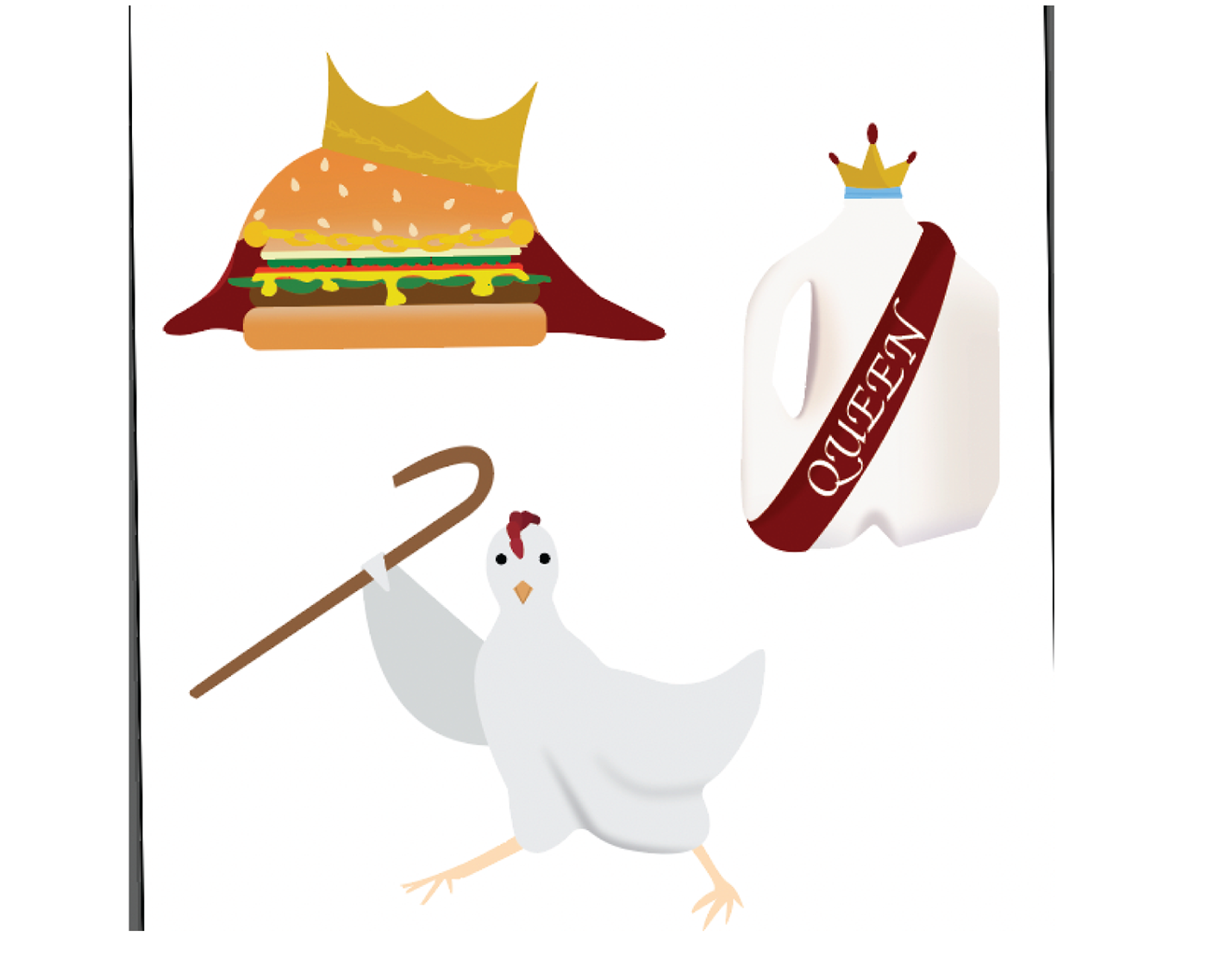
This project, I wanted to think outside of the box. With a pun in my head and a pencil in my hand, I was able to make this goal a reality. I was striving to create an idea that would be both funny, and a pun. With this goal in mind, I came up with stickers that represent chain food restaurants. . . I'll let you figure them out!

The sketching for this project was insanely fun. I had so many ideas, and to see them on paper made me excited to start on Adobe Illustrator. I wanted to figure out the right shapes and details on paper before hopping onto my computer. This was a huge help; it made the process a lot quicker.
I wanted the meaning of my stickers to speak for themselves. This was the hard part for me. How could I convey a message without saying anything?
My draft went really well. Because I was so detailed in my sketches, it made it really easy to put them into illustrator. There was still tons of work that I wanted to do with them, but for a draft, I was pretty satisfied.
I received some critique about the shadowing and gradients that I had on my draft. I needed to better understand the shapes of my stickers, and then figure out the shadowing from there. I also received feedback on the use of strokes. Adding thicker strokes to my final product made a huge difference in the look of my stickers. It helped them to "pop," while also making them look a bit less realistic (which is what I wanted!).


I seriously had a blast making these stickers. They made me laugh, and I hope they made you laugh too! I wanted to make some stickers that would represent chain food restaurants. Burger King, Dairy Queen, and Raising Canes were the designs I decided to go with. . . and I sure am satisfied with them. To create a sticker that has a deeper meaning, or pun in this case, was a really cool process to go through!

